Property Master, the UK’s first digital mortgage broker for buy-to-let landlords, is utterly unique. Set to disrupt the buy-to-let mortgage market by offering landlords the opportunity to assess their entire property portfolio via one dynamic, interactive portal, Property Master alerts landlords to the best mortgage offers available based on their current investments. The platform will even run ‘what if’ scenarios, such as raising rent or adjusting the loan-to-value ratio (LTV), allowing landlords to make fully informed financial decisions.
Creating a brand with impact
Ultimately, the new technology will save landlords money. And we needed to design a brand that not only succinctly explained what Property Master does, but that also caused a stir. As with all of our brand campaigns here at Delineo, the project drew on many our digital marketing agency’s creative resources. At the forefront however, was Andy, our Deputy Creative Director, and Ash, our Digital Designer, who between them masterminded the creation of the brand and the development of the campaign assets.
The inspiration ranges from Richard Hamilton and Peter Blake, through to Monty Python.
To find out a little more about how the campaign came together, I caught up with Andy and Ash, who were able to offer some insight into the inspiration behind the creative assets.
What was the original creative brief for the Property Master campaign? Were you given free rein with the design?
Andy: “Nick Melvin briefed me on the video at the outset, with a thought about ‘cutting out the broker’ or at least ‘cutting out the hassle’. I always try to seize a free rein whether or not it’s offered. I knew we needed something eye-catching in the promotional materials, like the video.
“For the UX, it seemed appropriate to tone that down a bit, to ensure a straightforward journey for customers, and create a more ‘businesslike’ feel. Ash’s clean modern page designs fitted the bill well.”
How did you come up the brand concept for Property Master? What was the inspiration behind it?
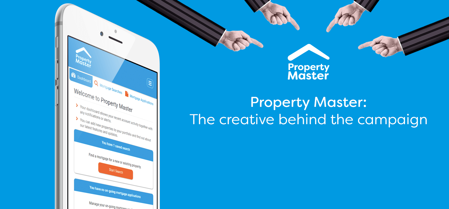
Andy: “As mentioned above, the notion of ‘cutting out hassle’ and the desire to produce something eye-catching and engaging led us to the cutout and collaged animation style.”
Producing the creative assets
What inspired the look and feel of the graphics for the video?
Andy: “The collaged effect is reminiscent of postmodernism and pop art, which found expressions in popular culture. So, I guess the inspiration ranges from Richard Hamilton and Peter Blake, through to Monty Python.”
The video features a mix of real-life images, graphics and a solid colour background – why was this unique combination chosen?
Andy: “The desire to be ‘unique’ was itself part of the reasoning. The solid colours are the dominant colours in Property Master’s brand. It was all driven by the desire to create a branded experience that stood out from the norm.”
Our competitor analysis led us to create an expressive, digitally focused brand identity that allows Property Master to lead the change in this evolving industry.
How did you animate the video?
Andy: “Once we’d grabbed or created source photography, Ash did all the technical work on the animation. So I’ll let him answer on the process from his side.”
Ash: “Using the source photography we wanted to recreate a traditional stop motion style animation using swift, sudden movements with cut transitions between scenes.”
What inspired the design of the Property Master logo?
Ash: “Property Master is a company pushing boundaries in the world of buy-to-let mortgages. Our competitor analysis led us to create an expressive, digitally focused brand identity that allows Property Master to lead the change in this evolving industry.”
The vibrant look and feel really stand out from other businesses in the property sector – was this part of the creative strategy?
Andy: “Absolutely: standing out and being bold were integral parts of the creative brief for a ‘disruptor’ in the market.”
With Property Master now open for business, we’re excited to see how the creative assets perform in an already competitive market. However, creative strategy and design was just one part of our full brand campaign for Property Master; find out how the full campaign came together by reading our case study.
Looking for a full service digital marketing agency to design and deliver a complete brand campaign for your business? Get in touch!